All work / UC Davis GSM / 6 min read
UC Davis GSM's Alumni Platform
I led the UX design for UC Davis GSM's first alumni platform, a place for graduates to keep learning and stay connected.
The short version
The Dean of the UC Davis Graduate School of Management wanted one place where alumni could earn certificates and keep learning from GSM courses. Our research showed that content alone wasn't the need. Alumni wanted community and career connection too. I designed the learning, directory, geomap and upload flows, then tested them with alumni and handed the Dean the research, designs and a Figma prototype.
Browsing learning content, searching, and finding alumni on the map.
Context
The school wanted one place for alumni to learn and connect.
Dean Unnava wanted to support alumni's professional success long after graduation. The GSM could offer professional certificates and course content, but before designing any of it, we needed to understand how alumni approach learning, support and staying connected.
Research
We started with how alumni actually learn.
Focus groups
Alumni expectations for career support, content relevance and community connection.
User interviews
Upskilling habits, learning formats and how much they trust GSM content.
Quantitative survey
The platforms they use, willingness to pay, pricing preferences and content access.

Core themes
Three themes became the platform's pillars.
Community and support
Alumni want transparent communication and to feel genuinely engaged after graduating, not just reached out to when it's convenient.
Networking and mentorship
Alumni want easier ways to connect professionally beyond their existing circles, for mentorship, jobs and industry ties.
Learning
Alumni want credible, time-efficient content that keeps them competitive and current.
Personas
Three alumni, three reasons to come back.
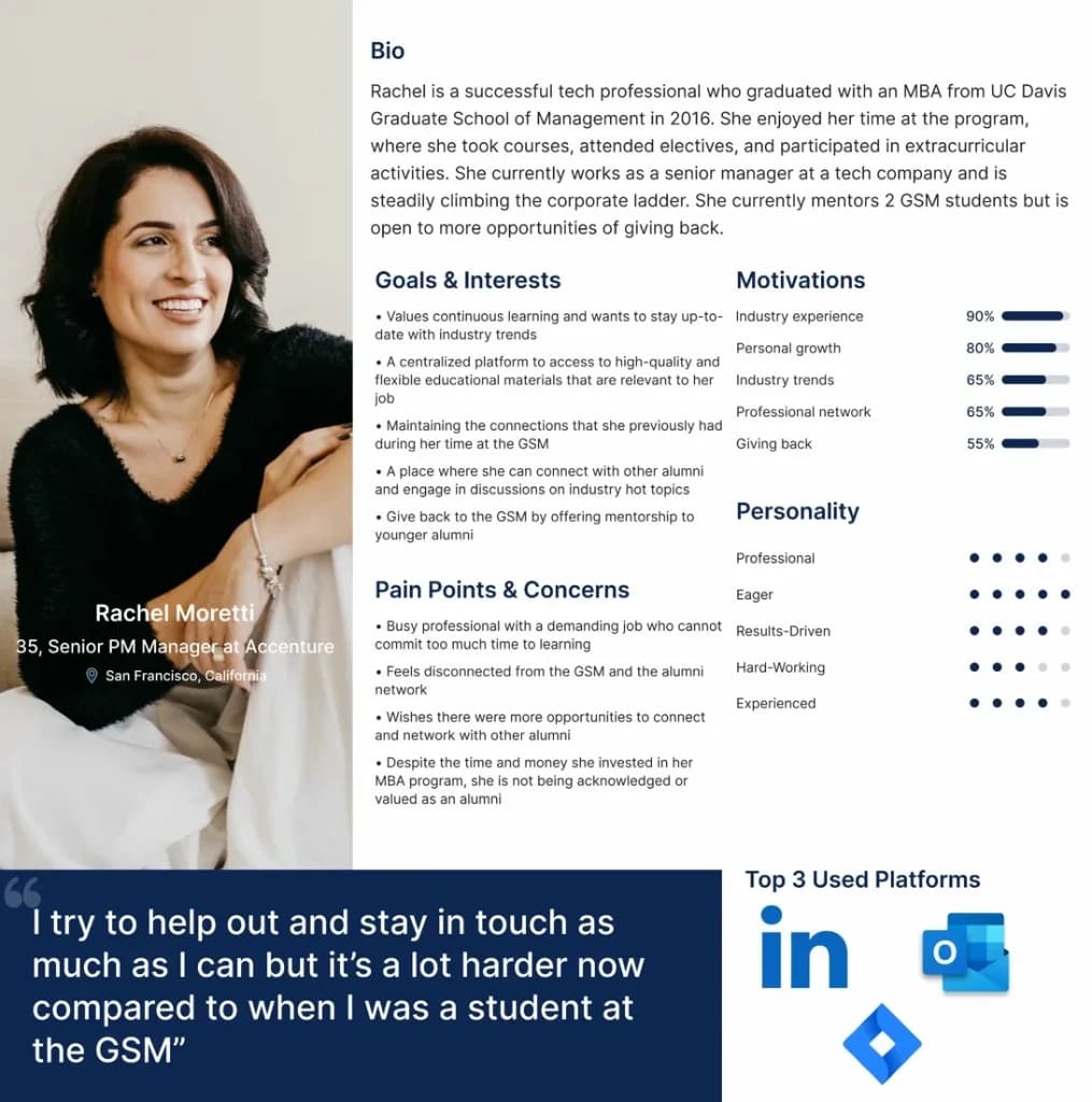
Established professionals. Confident in their careers and motivated to give back, often as mentors.
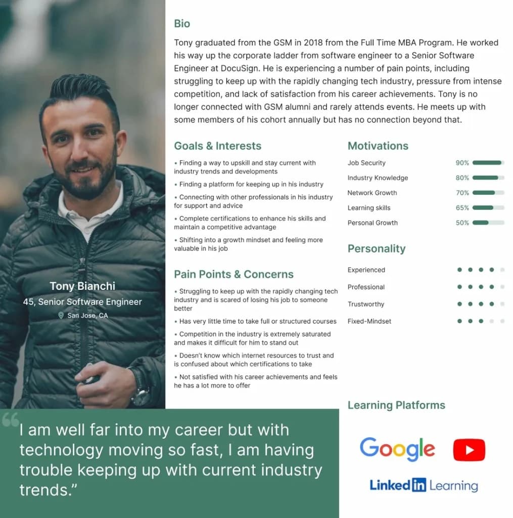
Mid-career professionals. Focused on staying ahead and upskilling with trusted resources.
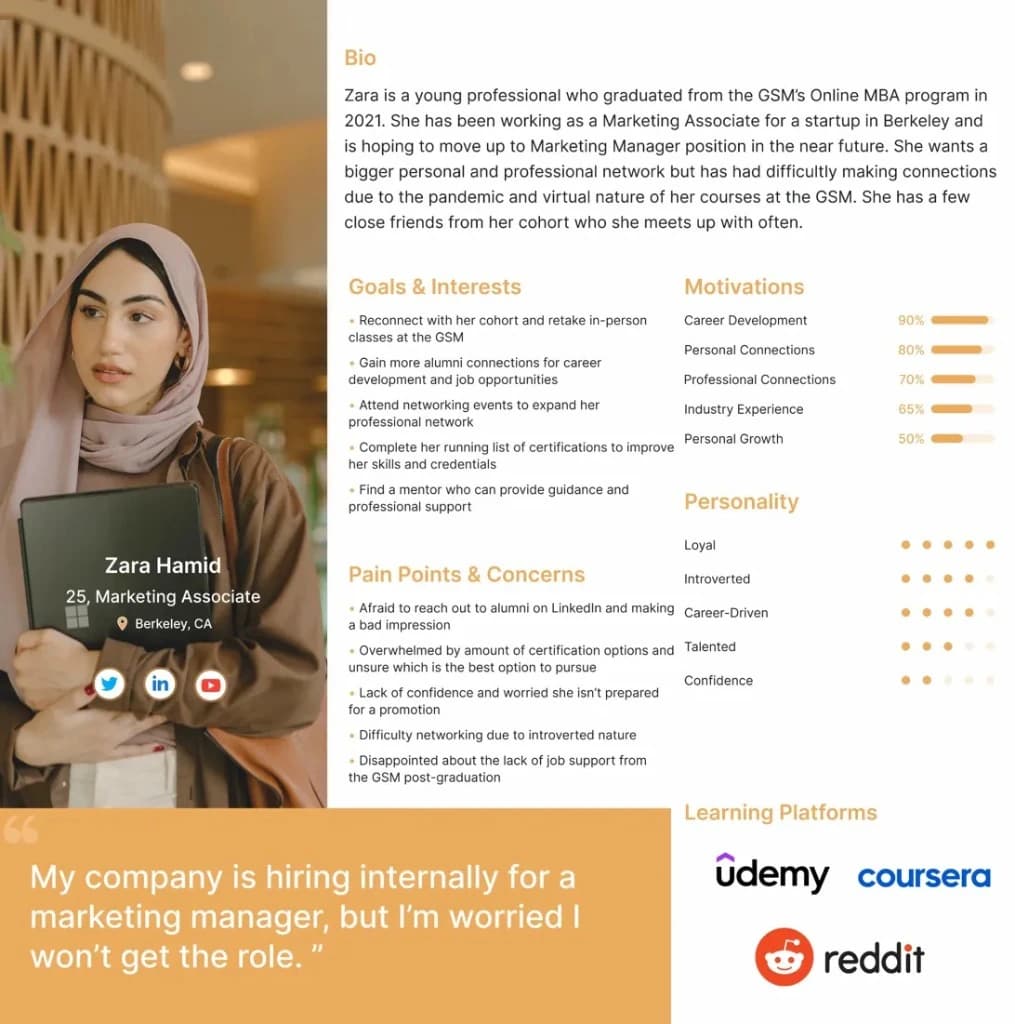
Early-career graduates. Navigating life after graduation and seeking guidance and light-touch networking.
The problem
Alumni needed more than content.
How might we create a centralized platform where alumni and students can access high-quality learning content, engage in meaningful professional conversations, and keep building a supportive GSM community for lifelong growth?
Scope
I put design effort where the scores pointed.
The PMs finalized the MVP feature set with the client. I used their priority and effort scores to decide which flows had to be complete enough to test, and which could stay shallow.
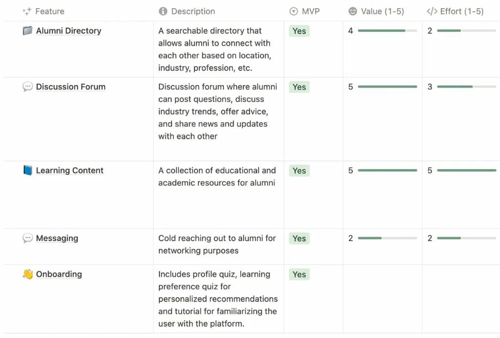
Product requirements.
Design
Mapping the flow from log in to messaging.

The user flow, from log in to discovery, the saved library, the directory, posts, messaging and profile settings.
Lo-fi to mid-fi
Core solutions first, branding second.
In lo-fi I got the core solutions on screen and only lightly refined lower-priority elements. At mid-fi I added branding, copy and interaction detail, so alumni unfamiliar with UX could test the Figma prototype and give focused feedback on the key features.

Usability testing
Testing turned three problems into structural decisions.
We tested the mid-fi prototype with alumni and rebuilt what tripped them up. Three problems ran deeper than a single screen.
Search had no clear purpose
Was it for people or content?
I split it into a focused search on the learning page, with a top nav pointing straight to the directory and forum.
Saved and published content had no home
Alumni couldn't find what they had saved or posted.
I added a bookmark icon linking to saved content, and moved uploading onto the learning homepage so every learning action sits in one place.
The geomap was buried
It sat inside advanced search.
I moved it to a single map-expansion button, front and center.

Increase visual engagement of the learning dashboard.

Simplified top navigation.

Easier access to saved content.

Fewer steps to edit learning preferences.

Simplified alumni directory and filtering.

Interactive geomap toggle.

Dedicated content upload page.

More visual hierarchy in the content form.
Outcome
Delivered with research, designs and a prototype.
| Piece | Status |
|---|---|
| Research and synthesis | Delivered |
| Designs and Figma prototype | Delivered to the Dean |
| Development | Left to the Dean's team |
The full flow is prototyped in Figma, from onboarding to the learning library, posting content, the alumni directory and the geomap. View the prototype
Reflection
Pushing Figma and learning from PMs.
Figma has limits.
Building the advanced filter pushed Figma to its edge. Without conditionals or multiple actions, I couldn't fully simulate the interaction, and that limited what usability testing could tell us. I still came out with interactive maps, scroll buttons and smart component swaps in my toolkit, and my first 8pt grid.
PMs are magic.
Watching our PMs work, from roadmaps in Notion to feature scoping and team alignment, gave me a deep respect for cross-functional collaboration.
Thank you to my team, AggieWorks, and Dean Unnava and the GSM for trusting us with this.